
Rebranding an Industry Leader
Vikor Teleconstruction

Sioux Falls Tower & Communications had a need to go beyond their geographically focused name and create a new brand that is bold enough to attract top recruits and stand out in a highly competitive market.
Before

After

Caliber has experience in rebranding many next-level companies with a proven approach and process that allows us to gather R+D to properly understand the company, their expectations and the industry. It was determined for Sioux Falls Tower & Communications that a new name, logo and brand would be necessary to set the foundation for achieving the goals set forth. Our team created the brand messaging and graphics so the final deliverables such as collateral, brand launch video, website, social platforms, wearables, trade show environment, etc. could all be based on the foundation established.


To stand out from their competition we presented an intriguing name that sparked curiosity, but also possessed a definition that correlated to their business. The name VIKOR was inspired by the Vikor method, a compromise-ranking algorithm developed to reach a solution that is closest to ideal in highly complex situations. We felt the definition aligned perfectly with their ideals. VIKOR’s purpose is to stop at nothing to reach the most desirable solution in an intensely technical and calculated work environment. We also like the name because of its indirect connection to VIKOR’s Northern Midwest roots. Like the early Vikings, they too identify with being rugged individuals, travelers, explorers and even conquerors.


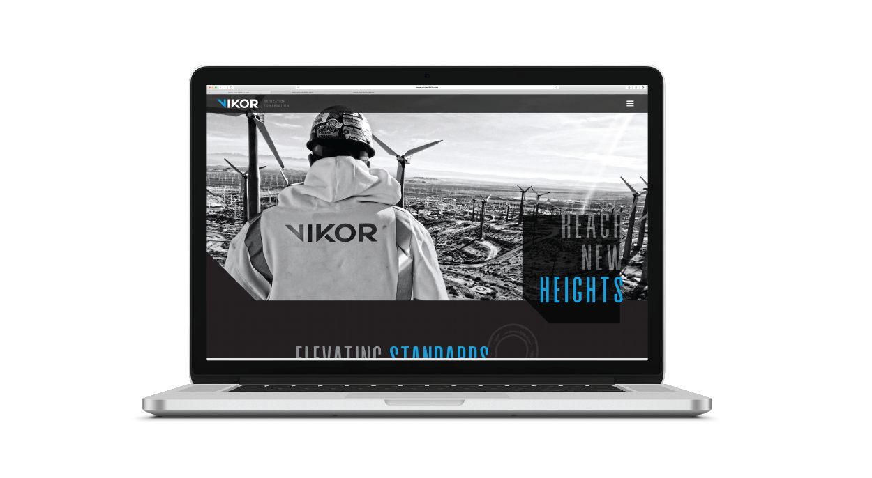
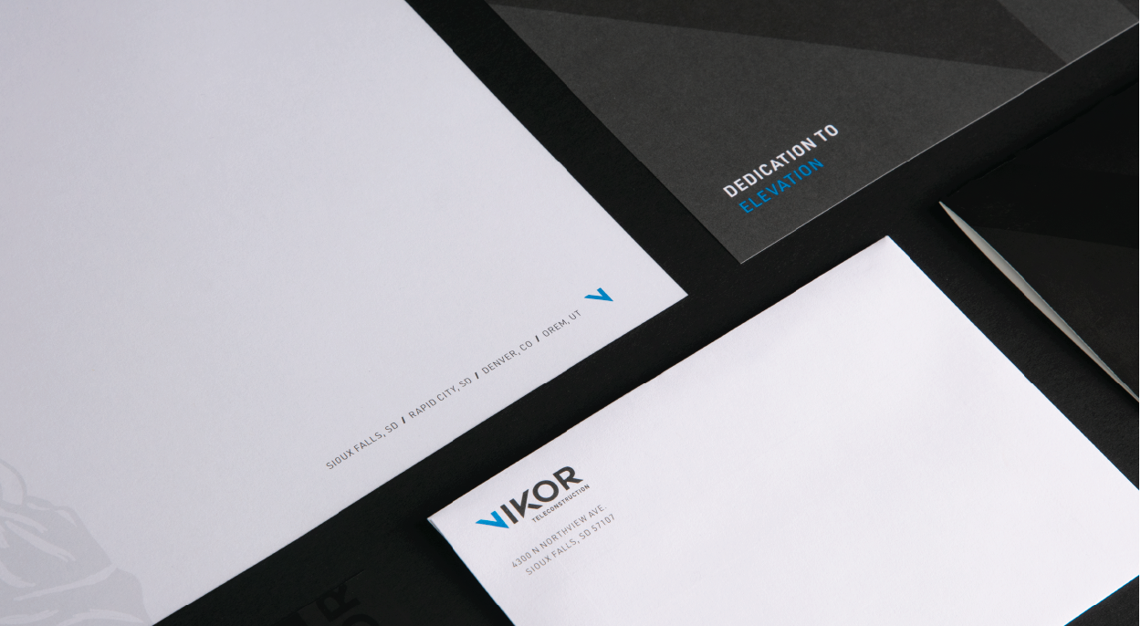
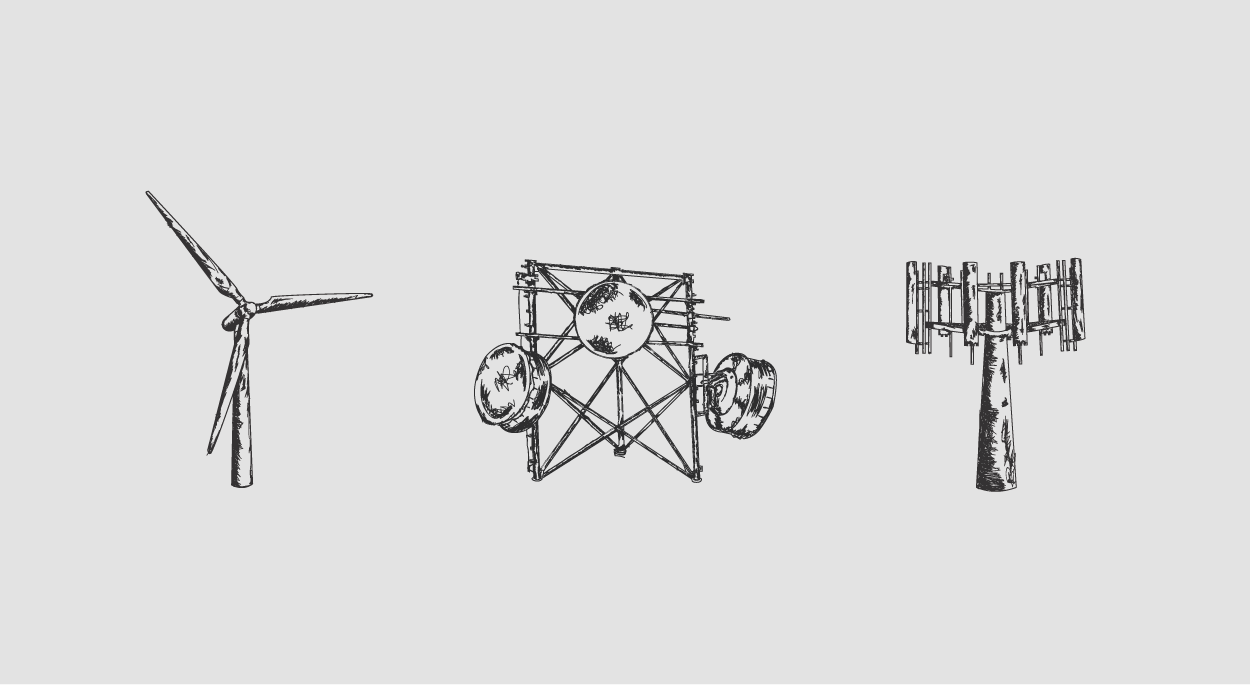
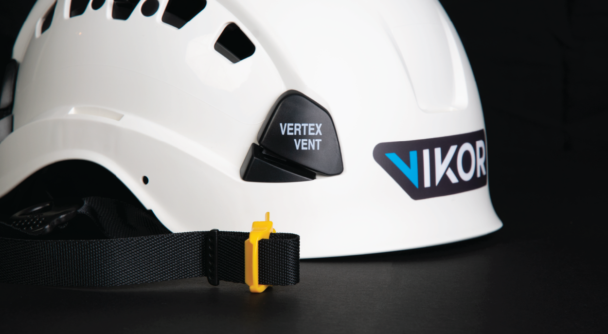
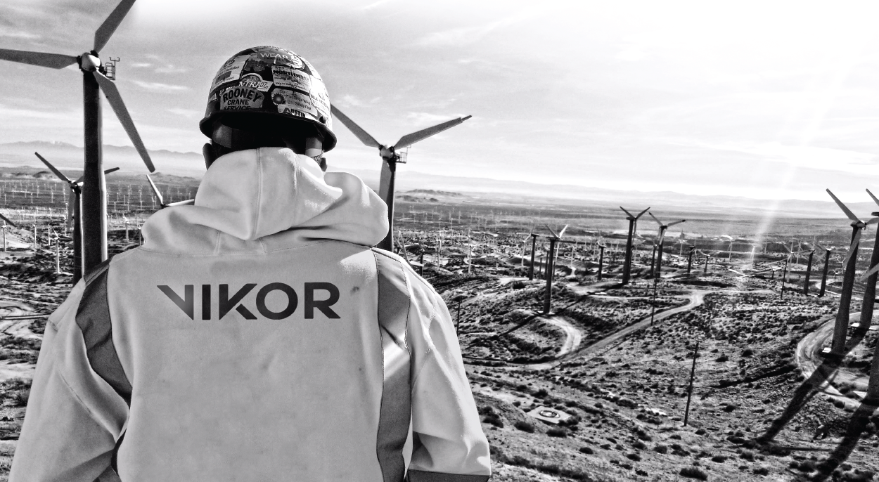
Be Bold. Be VIKOR. This statement reflects how we approached the visual look of VIKOR. The design is angular in nature, similar to the angles found within the metal structures that make up towers. The brand is positioned to be bold, masculine and professional. The boldness of VIKOR can be seen in our developed copy, photography and graphics.
The VIKOR brand was successfully launched internally and externally, which brought them a surge of new brand awareness, as well as new recruits to join the company. Following the launch, the new brand also won multiple American Advertising Awards.