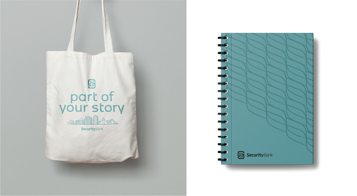
A brand ready to be part of your story
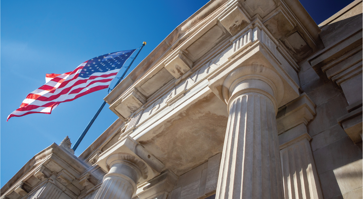
SECURITY BANK

THE CHALLENGE
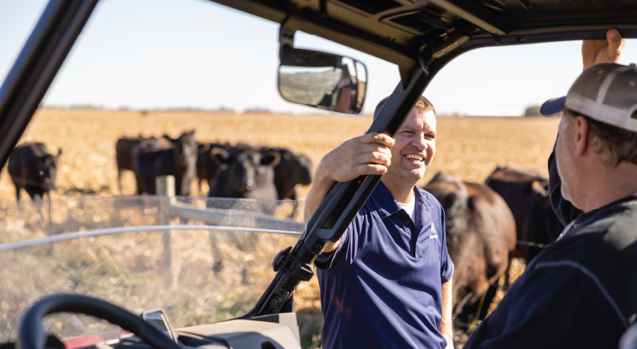
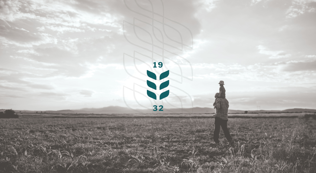
Security State Bank approached Caliber ready for a name change and an updated overall brand. Since 1932, Security State Bank has been serving South Dakota with five locations spread across Southeast South Dakota. Their main focus is on ag/rural customers, but they also wanted to expand their reach to urban markets in the area while still valuing their rural roots.


THE SOLUTION
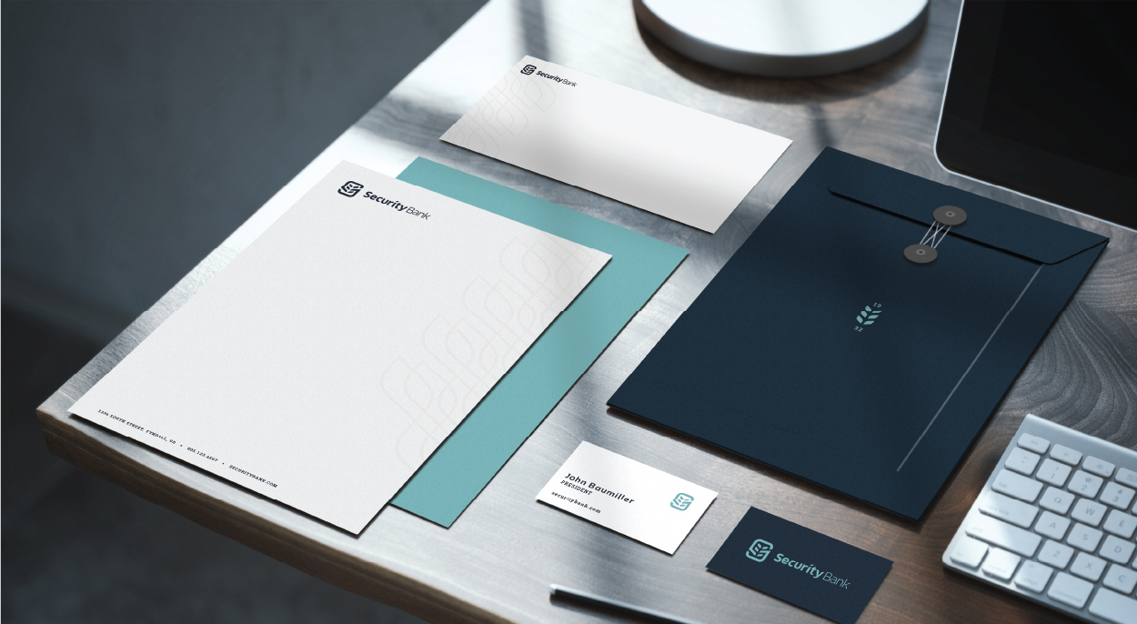
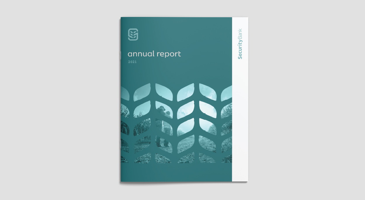
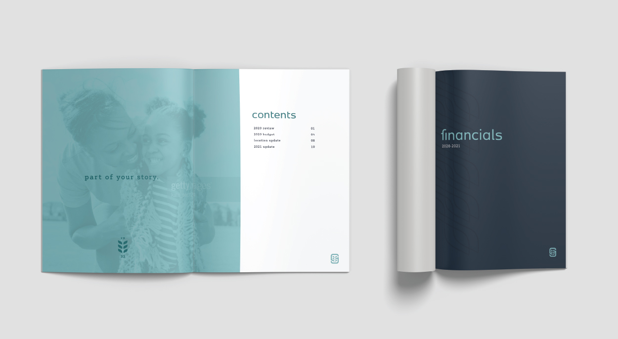
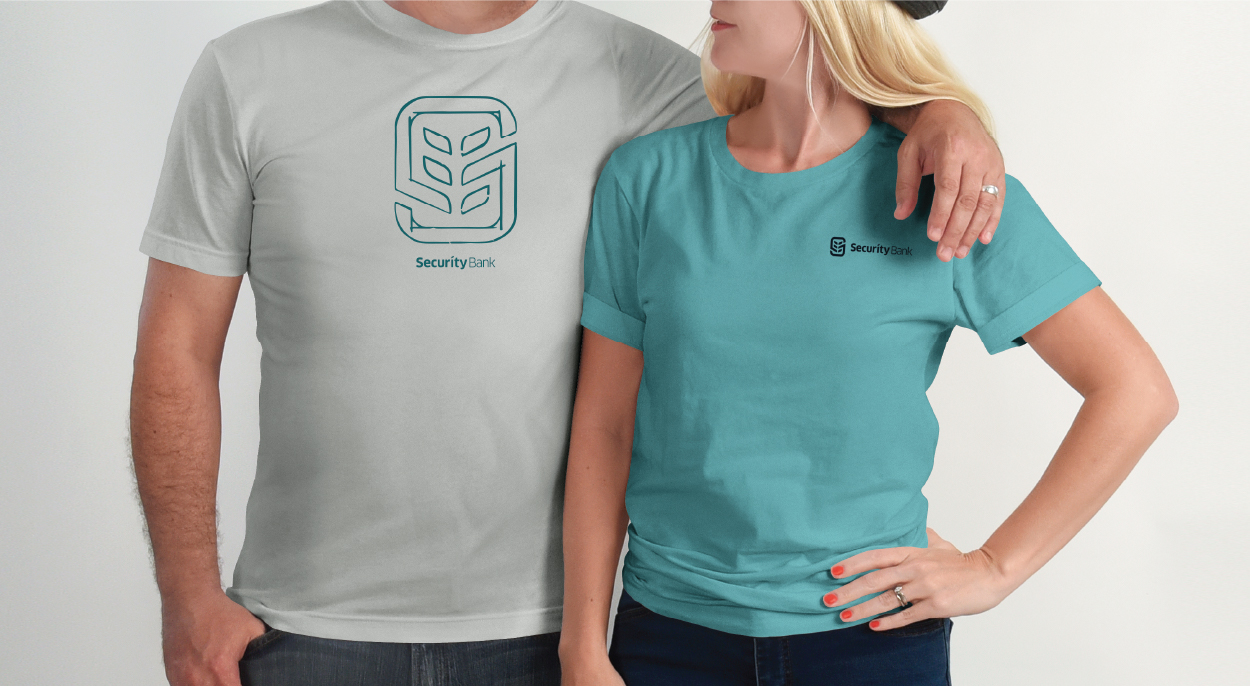
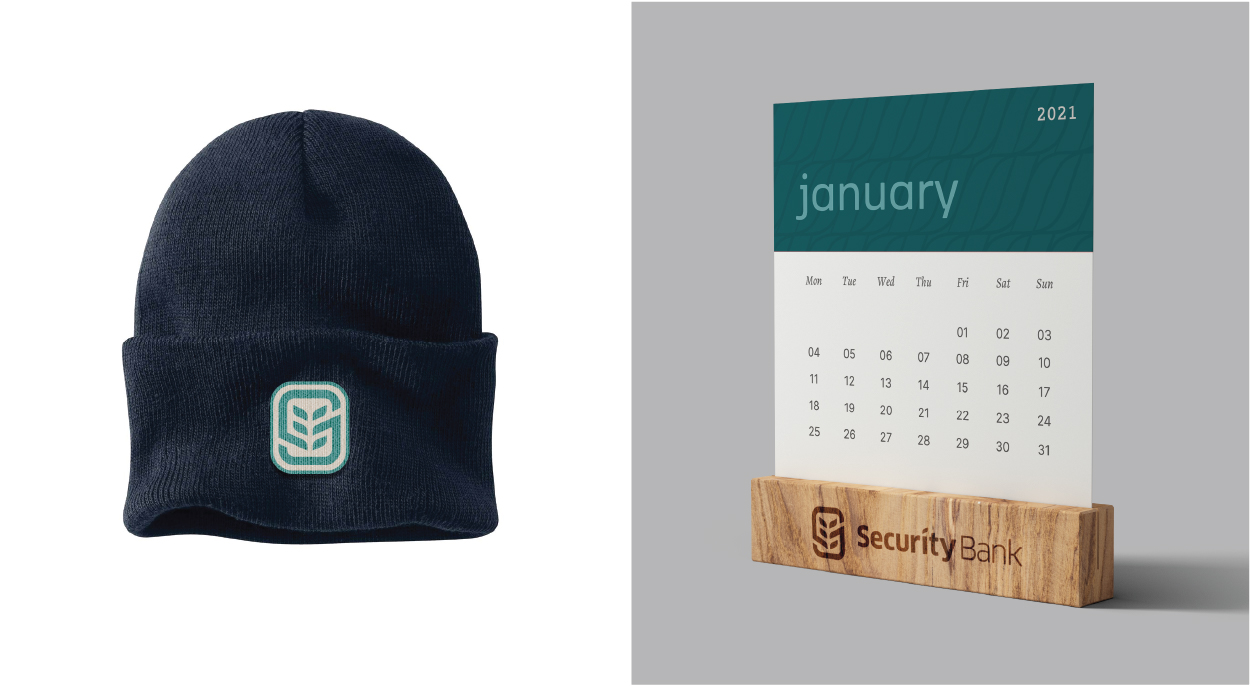
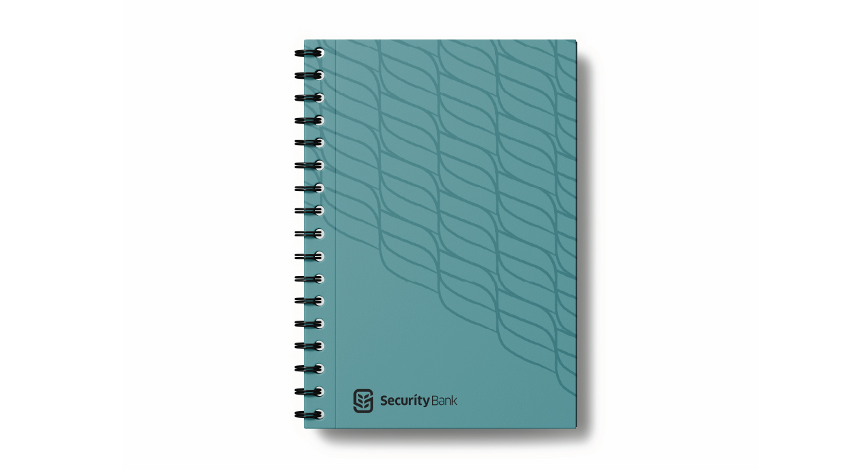
We simplified the name of the bank to Security Bank and created a new brand mark. The new logo represents the bank's agricultural roots and hometown values. The leaf shapes in the logo symbolize agriculture, as well as growth within the bank and the communities they serve. The 'S' holding shape in the logo gives it a feeling of being connected and secure, while the inner lines form an abstract handshake, representing dealmakers. The typeface used for 'Security Bank' has a unique san serif look that gives it a modern feel. All of these elements combined create a mark that is focused on agriculture, and represents qualities such as dependability, trust, and growth, with an aim to enrich the communities they serve.