Rebranding the Standard in Tower Safety
NATE

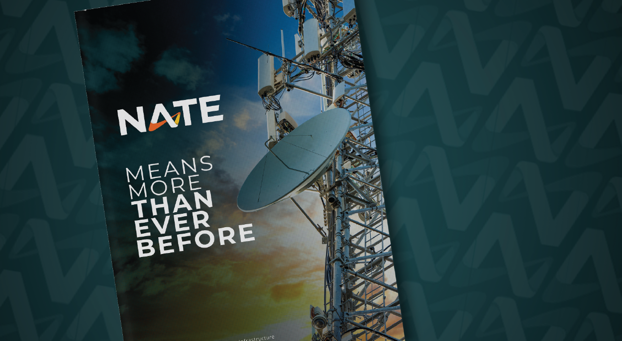
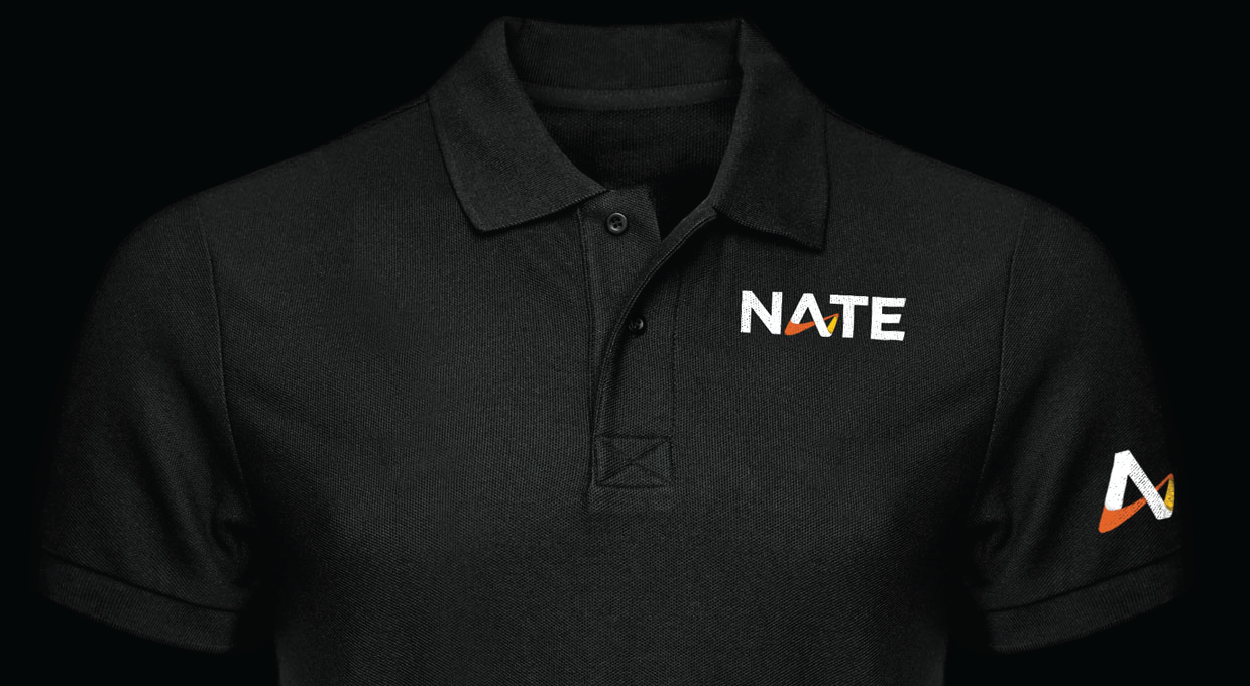
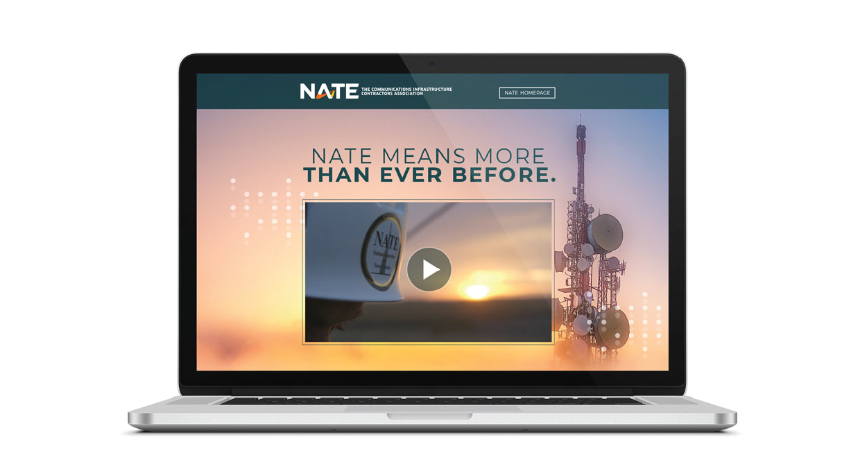
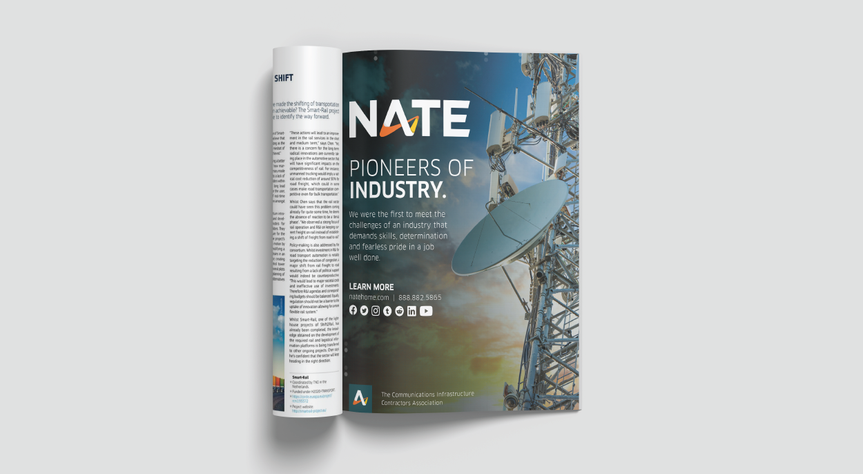
Caliber was sought after to create a new brand look for NATE – The Communications Infrastructure Contractors Association. NATE was looking for an update to their current brand in order to stay relevant and modernize the overall look and feel of their organization. The new logo was developed with the future of the association in mind. It has an innovative, technology focused vibe. The custom shape in the form of an A in NATE represents high tech, communication and connectivity to provide the future focused feeling the association is embracing. We created a custom blue-green primary color, and brought in bright accent colors in using orange and yellow to represent safety, technology and connectivity.