

All in. Always.
By Casey Schultz on Mar 23, 2020
Rebranding a national organization doesn’t come easy, especially when that organization is a vital part of the communication infrastructure industry. When NATE, the organization formerly known as The National Association of Tower Erectors, approached the Caliber team with the challenge, we went all in.
NATE’s previous organizational name, which contained “Tower Erectors” became a limiting factor for their membership, a name change was in order, but not in a way you would typically expect. For NATE to stay relevant within their industry it was decided that the organizational name would change to The Communications Infrastructure and Contractors Association, while keeping the overall NATE name in place. This change would positively impact the association and help continue to serve the telecommunications industry.
The NATE brand refresh posed some interesting challenges from a design standpoint. First and foremost, we were tasked with keeping the legacy alive, but also understood the need to attract a new segment of technological contractors that NATE was previously unable to reach due to misconception. These challenges were paired with a new organization name, which was no longer an acronym. The combination of these challenges created one, big, design pickle.
With all of these considerations in mind, our team developed multiple angles to solve this design problem. We referenced the heritage of the company, while looking forward to the future, with the use of modern green and a simplistic typeface, which then resulted in our solution of a simple and modern logotype.
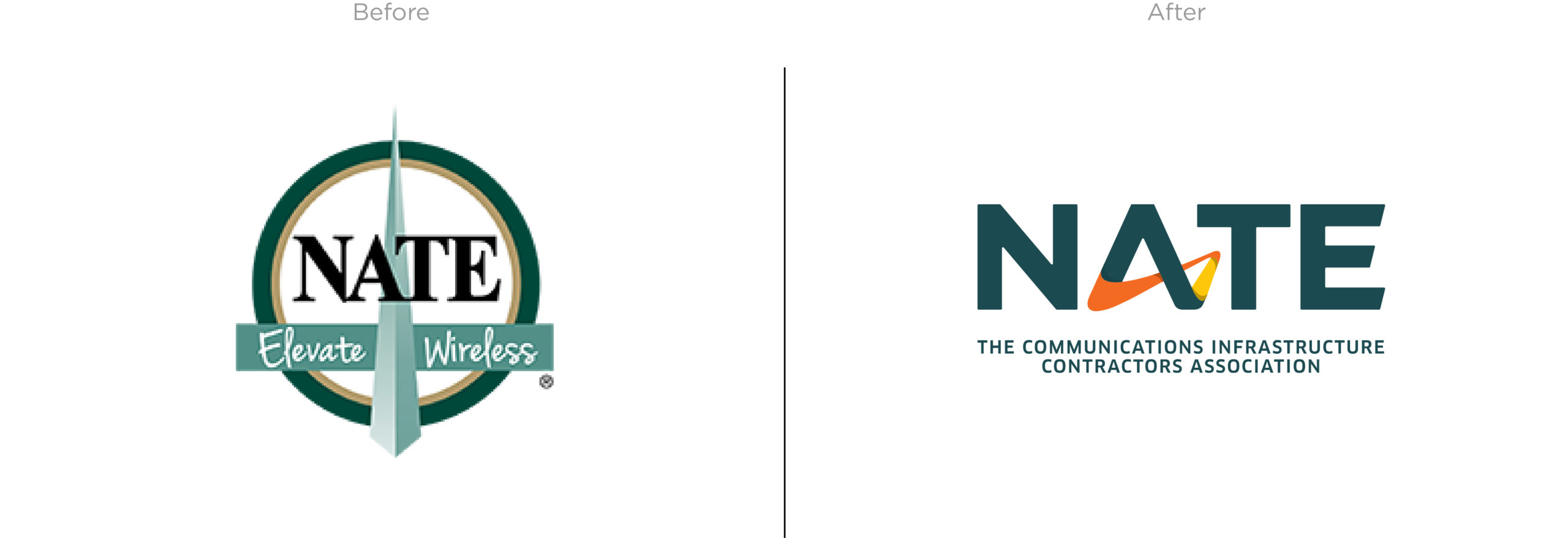
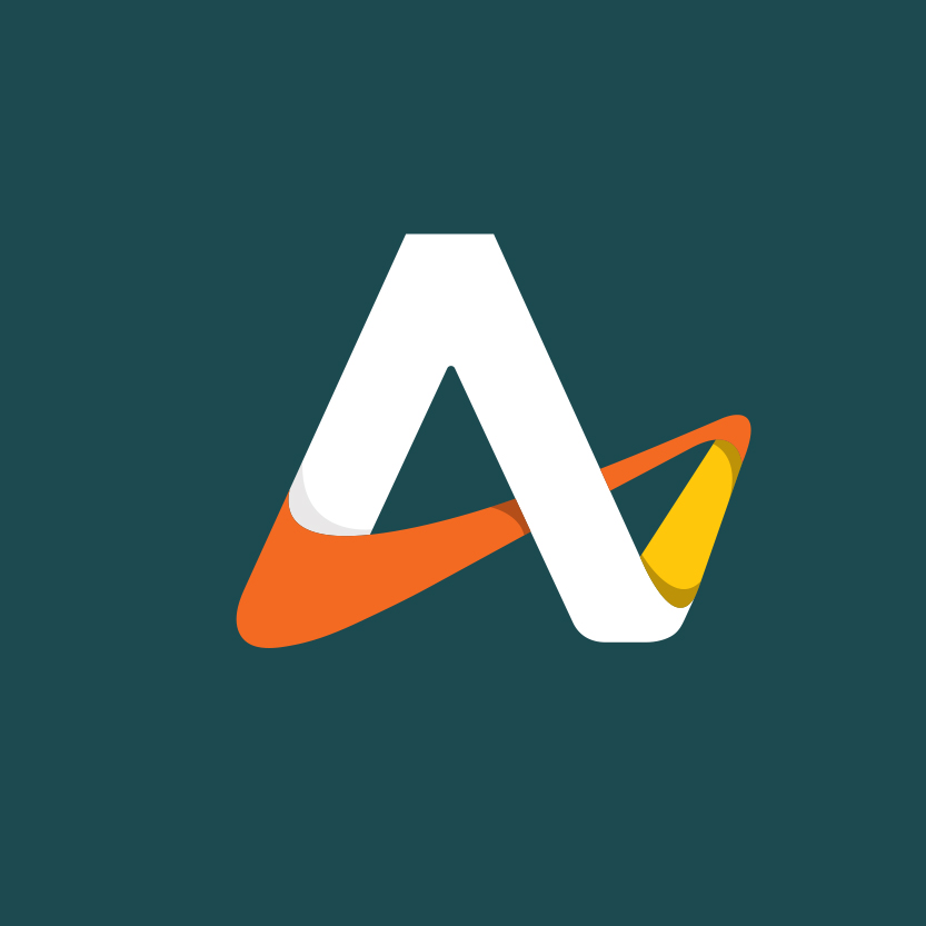
The logo incorporates the use of a custom letter, resembling an infinity shape and showcasing three main colors. These colors represent the organization’s three main grade areas for membership, where their members work and the industry they serve.
The membership is divided into three grades:
Above Grade – work done off the ground
At Grade – work done at ground level
Below Grade – work done below the ground
These grades rely and build off of each other, leading us to incorporate an easily identifiable symbol that represents the association as a whole. The other really cool thing about this symbol is its versatility. Within the logo mark it can represent an “A,” but as a standalone it can be seen as an “N,” which is then tied back to NATE.
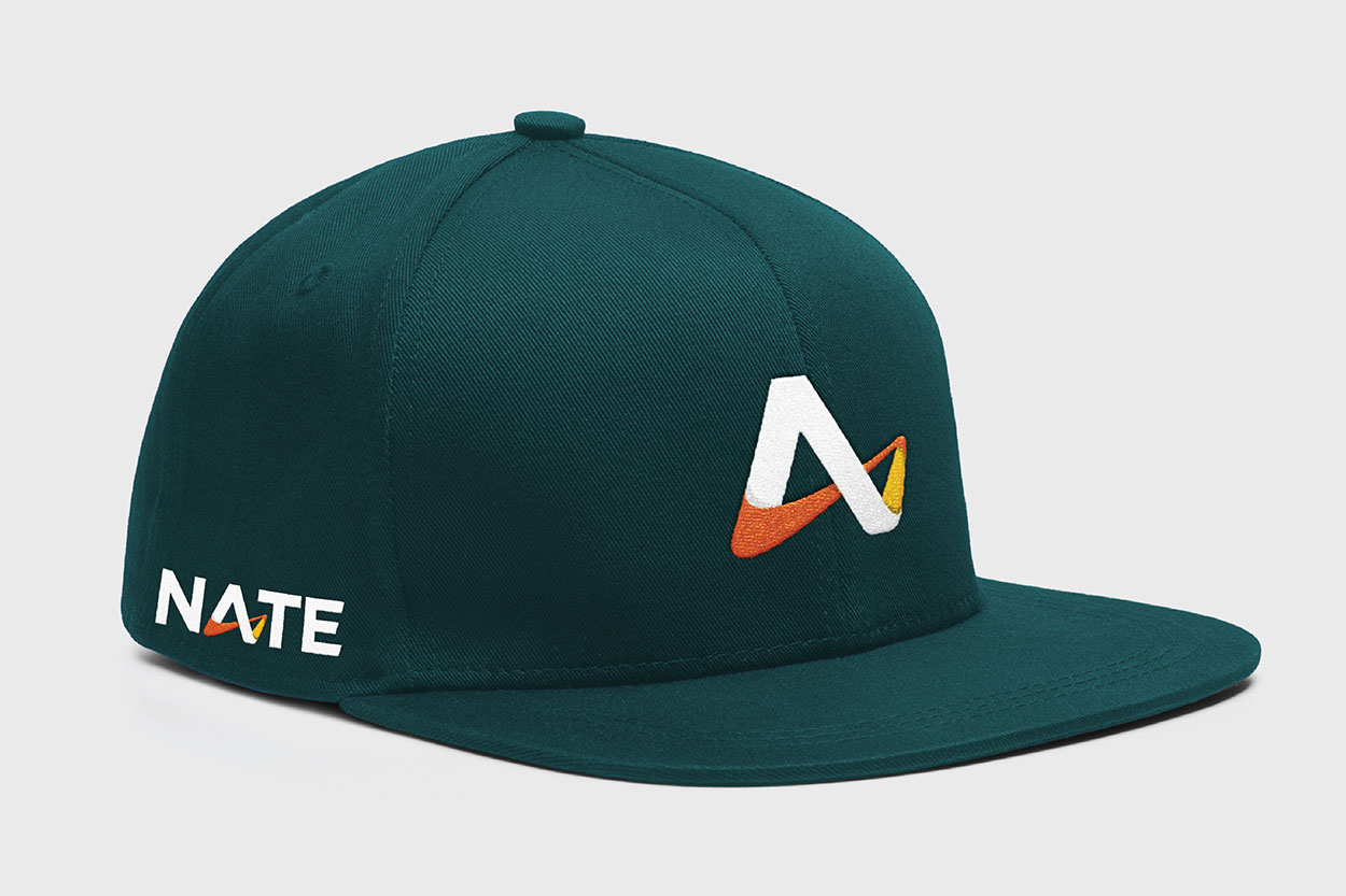
Along with a new logo and look, our amazing team here at Caliber helped NATE with brand copy, some sweet swag and a wicked brand unveiling video, all debuted at their annual conference for members. Check out the full case study here!
If you’re ready to take your company to the next level with a rebrand or brand refresh drop us a line.