

Reaching New Heights – A Bold Rebrand
By Casey Schultz on Apr 1, 2019
Rebranding a 30-year-old company comes with many challenges and hurdles, at least when it comes to our latest rebrand. Sioux Falls Tower & Communications is a very well-established player in the tower construction marketplace, but they had a desire to expand past their geographically focused name. Above changing up the geographical focus of the brand, we also needed to position the brand to have room to grow and appeal to a new diversified customer base. The focus of the rebrand was to give the brand a vision and purpose that would stand out in a highly competitive market. Beyond that, they wanted to attract a unicorn type of employee that’s young (21–30), tech savvy and full of grit – oh and isn’t afraid to climb up a 1,000 foot tower.
Our initial research of the marketplace gave us insight into how Sioux Falls Tower & Communications’ competitors were handling their marketing. This ranged from simple and minimal for some, to modern and sleek for others. To stand out from their competition we presented an intriguing name that sparked curiosity, but also possessed a definition that correlated to their business. The name VIKOR was inspired by the Vikor method, a compromise-ranking algorithm developed to reach a solution that is closest to ideal in highly complex situations. We felt the definition aligned perfectly with their ideals. VIKOR’s purpose is to stop at nothing to reach the most desirable solution in an intensely technical and calculated work environment. The name is also a meaningful tie back to the Northern Midwest roots of the company with the Viking like name. Vikings also nicely correspond with the image they would like to portray of being individuals, travelers, explorers and even conquerors.
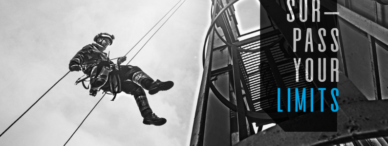
Be Bold. Be VIKOR. This statement is a great basis for how we approached the visual look of VIKOR. Overall the design is angular in nature similar to the angles found within the metal structures that make up towers. The look is meant to be bold, masculine and also professional. The boldness of the brand can be seen in the way we handled the images and copy throughout all materials.
Thank you to the team at VIKOR Teleconstruction for entrusting us with the freedom to create such a dynamic brand. The personal involvement and professionalism of our client helped this project go from a mere 100 foot tower to a mega super 2,000 foot tower. All of us at Caliber are more than grateful to those involved in the rebrand. We look forward to VIKOR reaching new heights!
Check out the full case study here!